
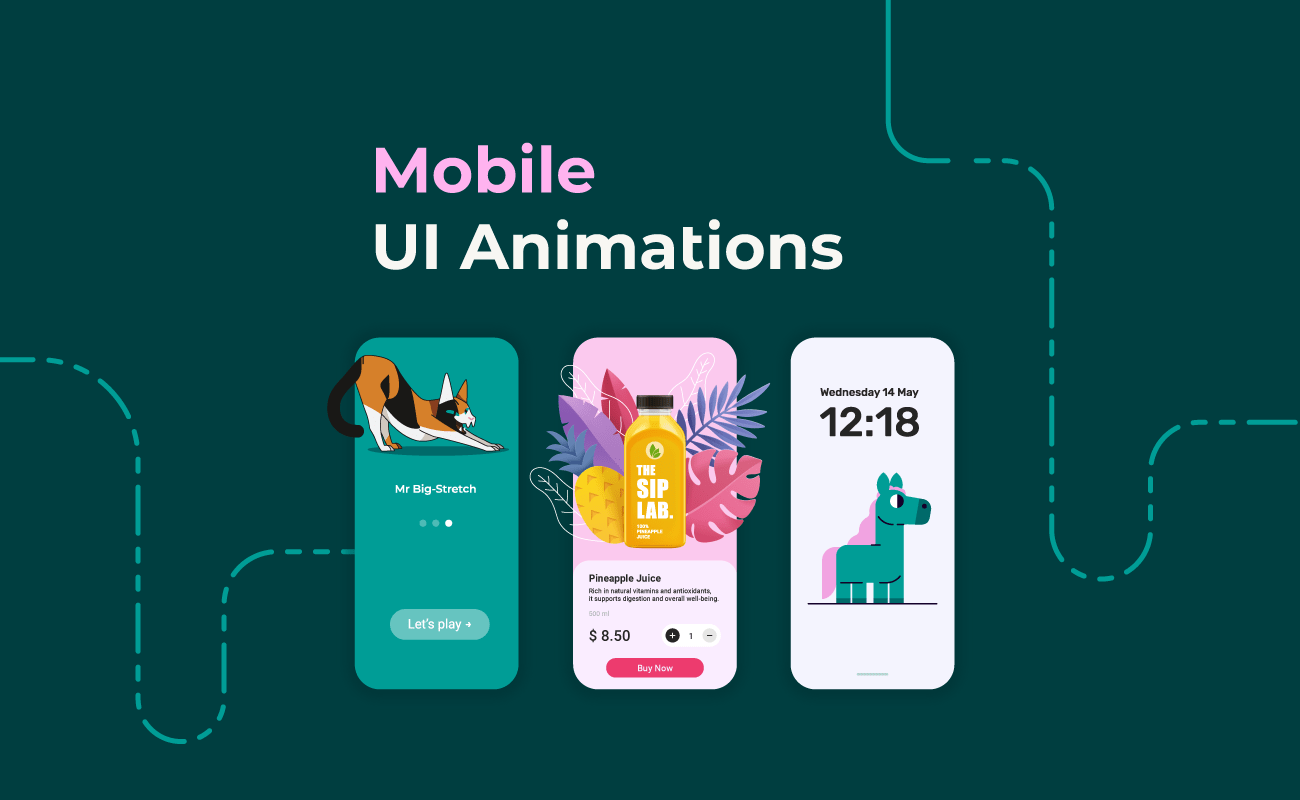
In today’s digital landscape, user interface (UI) design plays a crucial role in determining whether users enjoy an app, understand its functions, and continue using it over time. While design trends shift every year, one element remains consistently impactful across platforms: simple animations. These subtle visual motions—such as button highlights, page transitions, loading indicators, hover effects, or micro-interactions—play a powerful role in shaping user perception and engagement.
Animation is not merely decoration. It is a strategic tool. When used correctly, simple animations can guide users, communicate meaning, reduce friction, create emotional connection, and make digital interactions feel more intuitive and human. Apps and websites across different industries—from finance and productivity tools to gaming and education—rely on these animations to build smoother, more delightful experiences.
This in-depth article explores how simple animations improve UI experience, why they matter so much in modern design, the psychological principles behind them, and how they influence usability, engagement, and overall satisfaction. By examining real-world use cases and best practices, we can better understand why motion is such an essential part of the digital world.
1. Simple Animations Provide Visual Feedback
When users interact with an interface, they expect immediate confirmation that their action was recognized. Animation serves as a crucial bridge between user input and system response.
Why Feedback Matters
Human interaction is built on cause and effect. When we flip a switch or press a button in real life, we get an instant physical or visual response. Without such feedback, we feel uncertain or assume the action failed.
In digital interfaces:
- animations acknowledge user actions
- reduce confusion
- increase confidence
- prevent repetitive inputs
Examples of Feedback Animation
- A button briefly changes color when tapped
- A checkbox smoothly transitions from empty to checked
- A toggle switch slides from off to on
- A text field shakes lightly to indicate an error
- A heart icon fills when liked
These micro-animations reassure users that the system is responsive, functional, and attentive to their input.
2. Motion Helps Users Understand System Status
Users frequently wait for processes to complete: loading pages, uploading files, processing payments, generating results. Simple animations help communicate system status and reduce uncertainty.
Types of Status Animations
- Spinning loading indicators
- Progress bars
- Skeleton screens
- Animated checkmarks for completed tasks
- Sliding transitions between steps
Why This Improves Experience
When users see motion:
- they know the system is working
- they understand how long a process may take
- they remain patient
- they feel in control
Static pages with no animation often give the impression of freezing or malfunctioning.
The Psychology of Waiting
Animated progress indicators make wait times feel shorter. Even small motion—such as a pulsing dot or sliding bar—can reduce frustration. Users stay engaged and less likely to abandon the process.
3. Simple Animations Improve Navigation Flow
Good UI design helps users know where they are, where they came from, and where they are going. Motion serves as a visual storyteller that connects screens, actions, and transitions.
How Animations Guide Navigation
- Sliding panels show directional movement (left, right, up, down)
- Fade transitions indicate entering or leaving a page
- Expanding menus show hierarchy
- Animated breadcrumbs highlight the user’s current location
- Tab transitions reveal the relationship between sections
Motion creates continuity. Instead of jumping abruptly from one screen to another, animations make the journey feel natural and logical.
Example
In a mobile shopping app:
- tapping an item opens a product page that expands smoothly
- returning to the previous screen retracts it
This tiny animation signals that the product page came from the item user selected.
Such clarity strengthens orientation and reduces cognitive load.
4. Animations Reduce Cognitive Load
Cognitive load is the mental effort required to process information. Good UI design minimizes this burden. Simple animations help by visually organizing complex processes and showing how things work without overwhelming users.
Why Motion Reduces Mental Work
- Animations direct attention to important elements
- They show transitions without requiring interpretation
- They visually demonstrate cause-and-effect relationships
- They clarify what just changed on the screen
- They reduce the need for long explanatory text
Examples
- A field that expands when selected emphasizes focus
- A dropdown smoothly opening shows available choices
- A dragged object animating into place clarifies the rearrangement action
Animation provides clarity, turning potentially confusing actions into intuitive ones.
5. Motion Adds Personality and Emotional Connection
Users don’t just use apps—they build emotional relationships with them. A sense of friendliness or personality can significantly enhance the perception of an interface.
How Animation Creates Emotional Impact
- Playful icons that bounce softly
- A mascot character waving during onboarding
- A smiling checkmark when a task is completed
- A card shuffle animation in a game app
- A confetti burst for achievements
These small touches produce emotional delight. Emotionally positive experiences increase loyalty, retention, and user satisfaction.
Humanizing Digital Interactions
Animation simulates real-world physics—elasticity, gravity, friction—making digital environments feel familiar. This human-centric approach makes experiences more enjoyable and relatable.
6. Animation Draws Attention to Important Actions
Motion naturally grabs attention. Designers use this principle to highlight key areas or guide users toward important tasks.
Examples of Attention-Guiding Animation
- A pulsing “Record” button
- A subtle shake indicating a mistake
- A glowing “Start” button for first-time users
- A tooltip that gently slides into view
- A highlighted menu icon after an update
These animations help users focus on what matters most.
Avoiding Overload
It’s not about throwing animations everywhere. Simplicity is key. Overuse becomes distracting. But when used sparingly, animation can direct attention with precision.
7. Simple Animations Improve Accessibility
Accessibility isn’t only about color contrast, screen readers, or font size. Motion can also make an interface more inclusive for diverse users.
How Animations Support Accessibility
- Reinforcing actions with visual cues helps users with cognitive disabilities
- Guiding navigation assists those who might struggle with complex layouts
- Animated instructions help users with limited literacy
- Progress animations help users with memory challenges track system activity
Examples
- A red shake animation to indicate incorrect login
- A gentle highlight around a selected element
- Step animations that guide users through a tutorial
When thoughtfully designed, animation supports users who need extra clarity.
8. Motion Explains Interactions Without Words
One of the most powerful uses of animation is instructional communication. Instead of paragraphs of instructions, motion shows users how features work.
Examples of Instructional Animation
- Drag-and-drop hints
- Animated arrows pointing to interactive elements
- Swiping demonstrations during onboarding
- Icons that animate to show capabilities
- Tutorials with animated sequences
These are especially helpful in:
- design apps
- photo editors
- productivity tools
- mobile games
- educational platforms
Animation makes learning fast, intuitive, and universal.
9. Smooth Transitions Create a Polished, Professional Feel
Users judge the quality of an app not only by its functions but by how refined the experience feels. Smooth transitions add polish and craftsmanship to the interface.
Why Polished Animation Matters
- It enhances brand perception
- Demonstrates attention to detail
- Shows that the app is modern and professionally developed
- Helps users trust the product
Even micro-animations—like easing functions when elements move—give the app a premium feel.
Brand Identity Through Motion
Each brand can use a unique animation style to reflect its personality:
- calm, slow fades for meditation apps
- bouncy, playful movements for kids apps
- sleek, minimal transitions for finance apps
Motion becomes a part of the brand language.
10. Simple Animations Encourage Exploration
Users are more likely to explore when animations spark curiosity and provide gentle guidance. Motion hints at interactivity and invites users to discover new features.
Examples
- A menu icon that transforms when tapped
- A hidden drawer that peeks slightly to suggest swiping
- A gently bouncing “New Feature” badge
- Icons that animate to reveal secondary functions
Animations help users find features they might otherwise overlook.
11. Animations Make Multi-Step Tasks Feel Lighter
Many apps require users to complete long or multi-step tasks. These processes can feel tedious, but animation can break them into easier-to-digest segments.
Examples
- Step-to-step slide transitions in forms
- Progress animation for uploads
- Animated checkmarks after each completed stage
- Expanding cards to show next steps
Motion transforms large tasks into smaller, more manageable moments.
Psychology Behind the Effect
Humans are naturally motivated by progress visualization. Seeing forward movement—even through animation—boosts motivation and reduces perceived effort.
12. Motion Strengthens User Memory
Visual memory is far stronger than text-based or static memory. Animation takes advantage of this by creating dynamic moments that users remember more easily.
Examples
- Users remember where a button is because it animates when tapped
- A sliding menu helps users recall its location
- An animated gesture hint reinforces how a feature works
This helps users learn interfaces faster.
Why Memory Matters for UI
An app that’s easy to remember is one that users return to. Reduced relearning effort increases overall app usability and satisfaction.
13. Animation Helps Maintain Consistency Across UI Components
Consistency is essential for usability. Animation helps tie all components together so the experience feels unified.
Examples of Consistent Motion
- All dropdowns open with similar easing
- Buttons animate with the same feedback pattern
- Page transitions follow a unified style
- Cards always expand/contract the same way
Consistency eliminates confusion and strengthens the interface’s overall structure.
14. Simple Animations Enhance Storytelling
Storytelling is a powerful engagement tool, especially in onboarding or educational content. Motion helps tell stories more clearly and emotionally.
Examples
- An animated character guiding users through setup
- Process steps illustrated through movement
- Animated icons that transform to represent progress
- Smooth transitions that reflect a narrative sequence
Users connect more deeply with apps that communicate through engaging motion.
15. Animation Makes Apps Feel Faster—even if they aren’t
Sometimes animation can create the illusion of speed. Well-timed micro-interactions make the interface feel responsive even when actual processing takes time.
How It Works
- Skeleton screens simulate content loading
- Quick fade-ins hide lag
- Button animations start instantly even if the action takes time
The result: a faster-feeling app.
Why Perception Matters
User satisfaction depends more on perceived speed than real speed. If animations reduce the feeling of waiting, users feel the app is efficient.
16. Improves the Overall Aesthetic and Visual Appeal
Good aesthetics enhance enjoyment. Simple animations can turn functional designs into delightful experiences.
Ways Animations Beautify UI
- Smooth hover effects
- Clean transitions
- Animated icons
- Soft shadows and micro-movements
A beautiful interface attracts users and keeps them interested.
17. Encourages Return Visits and Long-Term Engagement
Users are more likely to return to an app that feels polished, intuitive, and enjoyable. Animation contributes to long-term engagement in subtle but powerful ways.
Why Users Come Back
- Animations make tasks feel smooth
- Emotional delight encourages positive feelings
- Motion-based clarity reduces frustration
- A visually dynamic interface feels modern and relevant
Apps that feel alive keep users engaged longer than those that appear static.
18. Reduces Errors by Clarifying Cause and Effect
Many user mistakes stem from uncertainty about how elements behave. Animation clarifies interactions and reduces misclicks.
Examples
- An invalid field shaking reduces guesswork
- A dragged item snapping into place prevents misplacement
- A transition back to a previous screen shows the action has been undone
Fewer errors mean a more pleasant experience, improving overall adoption.
19. Supports Gesture-Based Interactions
Modern mobile interfaces rely on gestures: swiping, dragging, pinching, long-pressing. Animation is essential for explaining these interactions.
Examples
- A card sliding when swiped
- A page bouncing gently when pulled too far
- A long-press ripple effect
- A drag animation showing potential drop zones
Gestures become intuitive when supported by motion.
20. Simple Animations Strengthen Brand Identity
Brands differentiate themselves not only through logos or colors but also through motion characteristics.
Motion as a Brand Signature
- Facebook’s bouncing reactions
- Apple’s smooth physics-based transitions
- Google’s fluid Material Design animations
Motion becomes an identity marker that shapes user perception.
Conclusion: Why Simple Animations Matter So Much
Simple animations are not add-ons—they are foundational to modern UI design. When used strategically, they:
- guide navigation
- reduce cognitive load
- clarify actions
- provide feedback
- improve accessibility
- enhance emotional connection
- boost aesthetics
- increase engagement
- reduce errors
- streamline multi-step tasks
- reinforce brand identity
The result is a UI that feels intuitive, responsive, and delightful to use.


Leave a Reply